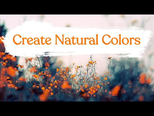
Using natural colors creates the best color palettes
The Wildflower Color Theory

Erick Aroldo
Graphic Design
October 10, 2021
3
min read
In floral design, there is a belief that everything natural will complement each other. And I have found this to be very true.
In nature, if you just stop and look around, you will notice the beauty of life’s design. From the sky’s immaculate blues of the afternoon to the serene gradients of the evening skies.
And if you are looking for a more natural direction in your design, the absolute best piece to start with...is your color. Your design will start with the proper choice of colors and beyond that, the tones and shades that you will use for your work.
Your selection of tone is a matter of finding the right balance between the brightness, depth, and hue of the colors within your palette.
In a field of wildflowers, you don’t ever see colors that don’t go together with each other because they all just do. When you look at a wild field of flowers, you will notice that every different color of flower complements the next, right beside them and beyond. It’s simply natural.
Take a look at your next design and ask yourself, does this look natural? Can you properly read and evoke a natural emotion within your work? If the emotions are there, are they the right emotions that you’re trying to convey? If not, are they the right colors?
If you can get a second opinion, ask someone else to see what they feel about your design, without telling them to focus on the color (in fact don’t even mention the color). Try to receive an authentic first impression of your work. This will help you create a strong foundation for your design.
There are many outlets where you can get your colors from, anywhere from online to premade color palettes. Depending on your work and the project you’re working on, if you want to focus on naturalism, go outdoors, and take pictures of the sky, trees, grass. Nature. It’s all there. Then sample those colors. They will not be 100% accurate because of camera settings affecting the light and depending on the time of day, the color will differ. But it will be most representative of the natural color palette you want to achieve.
Save that color palette. Those are a sample of natural colors that you harvested yourself.
Natural colors are everywhere and if we take a moment to not only acknowledge its beauty but to sample it for our own work, it could make our designs even just the slightest bit more natural.
Written by
Erick Aroldo
Erick Aroldo is a graphic designer based in Sacramento, CA, with a passion for exploring the deeper meaning behind design. After freelancing for a decade even before finishing high school, Erick has spent the last five years working professionally in the field, bringing a strong conceptual focus to every project. He believes that understanding the why behind design is just as crucial as mastering the how. That philosophy inspired him to create Design Culture Now, a website and show dedicated to sharing compelling stories from design history and culture. Through this platform, Erick invites fellow creatives to engage with the intellectual and cultural roots of design, highlighting the ideas that shape visual communication as much as the tools that bring it to life.
More articles by
Erick Aroldo